
NEOM
"Made to change."
The Brief
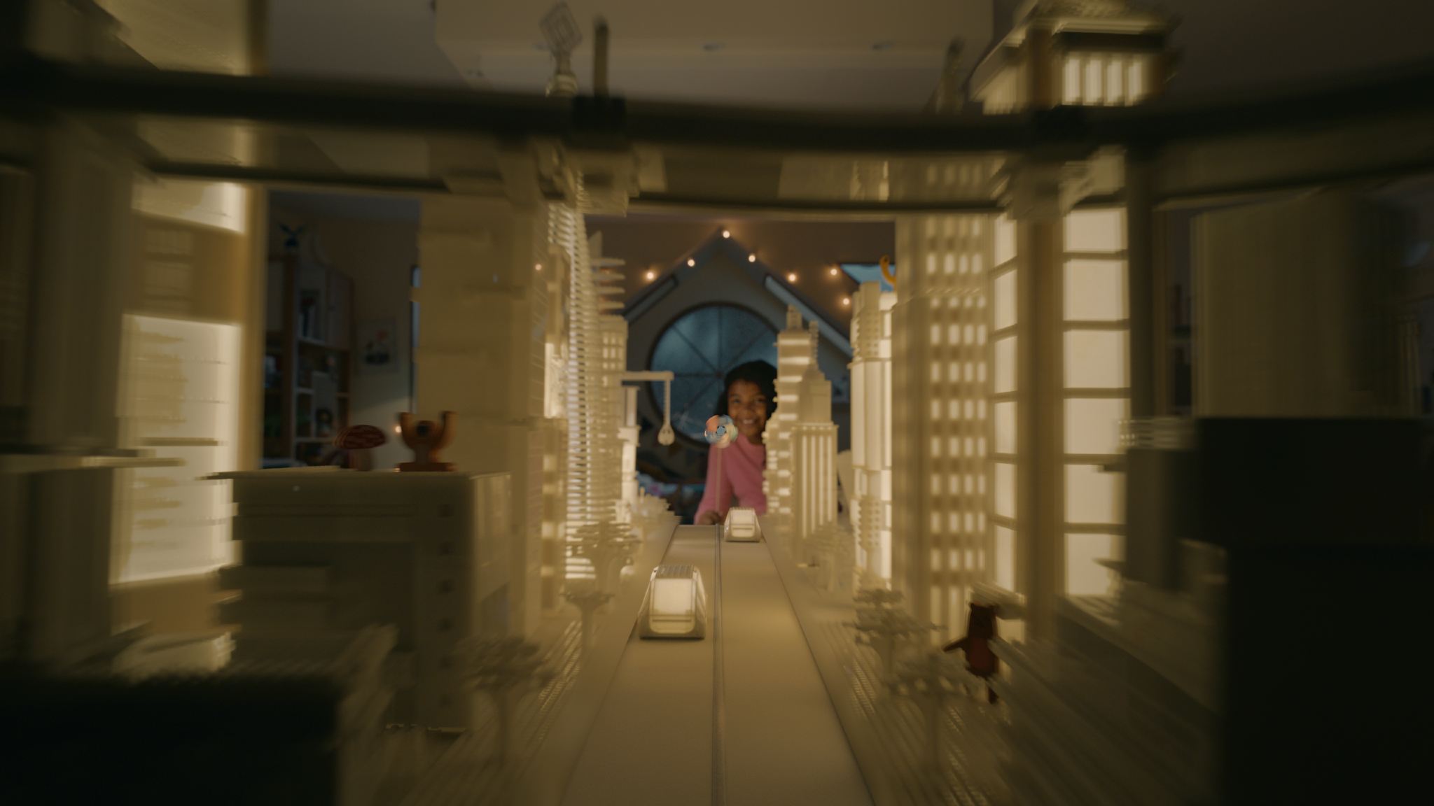
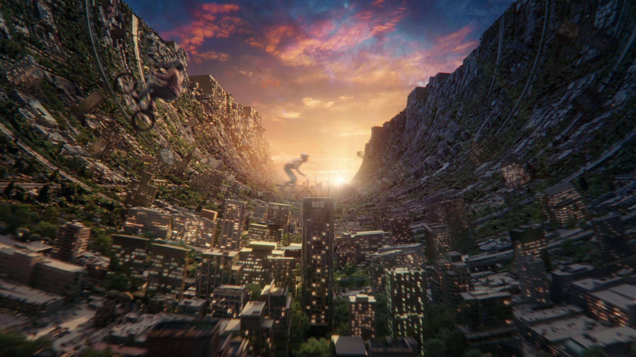
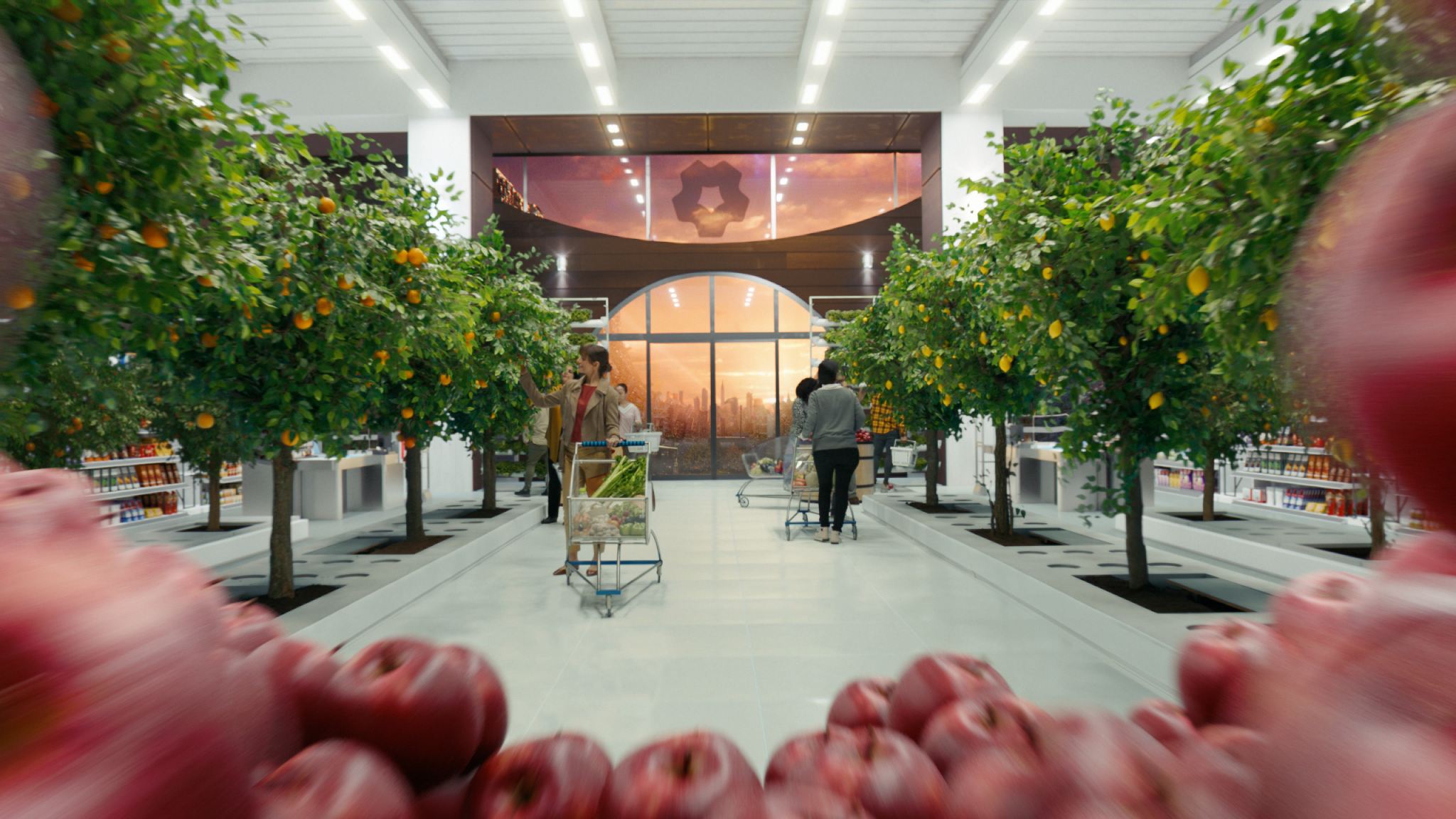
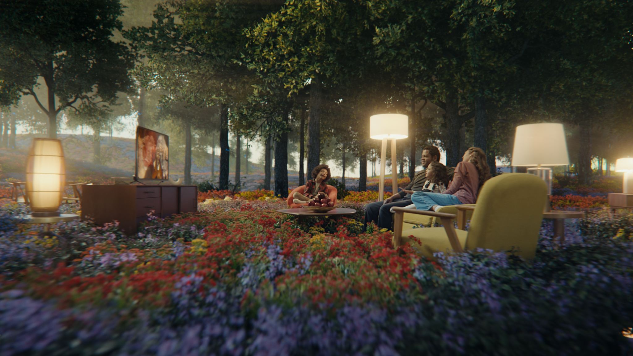
In 2021, when working in UPP Advertising, the studio got to work on a commercial for the NEOM project. The director was Dave Mayers, and it marked our first collaboration with him with many future projects to come. The brief was to create one continuous shot going backwards, central composition, no cuts, all transitions between like 16 environments — easy 🙂
The Process
I was brought on board from the start by our VFX supervisor Mario Dubec, and we started chatting with the client and the director about the visuals and planning shots. I put together tons of reference boards, and we started figuring out the shot layout and pacing.
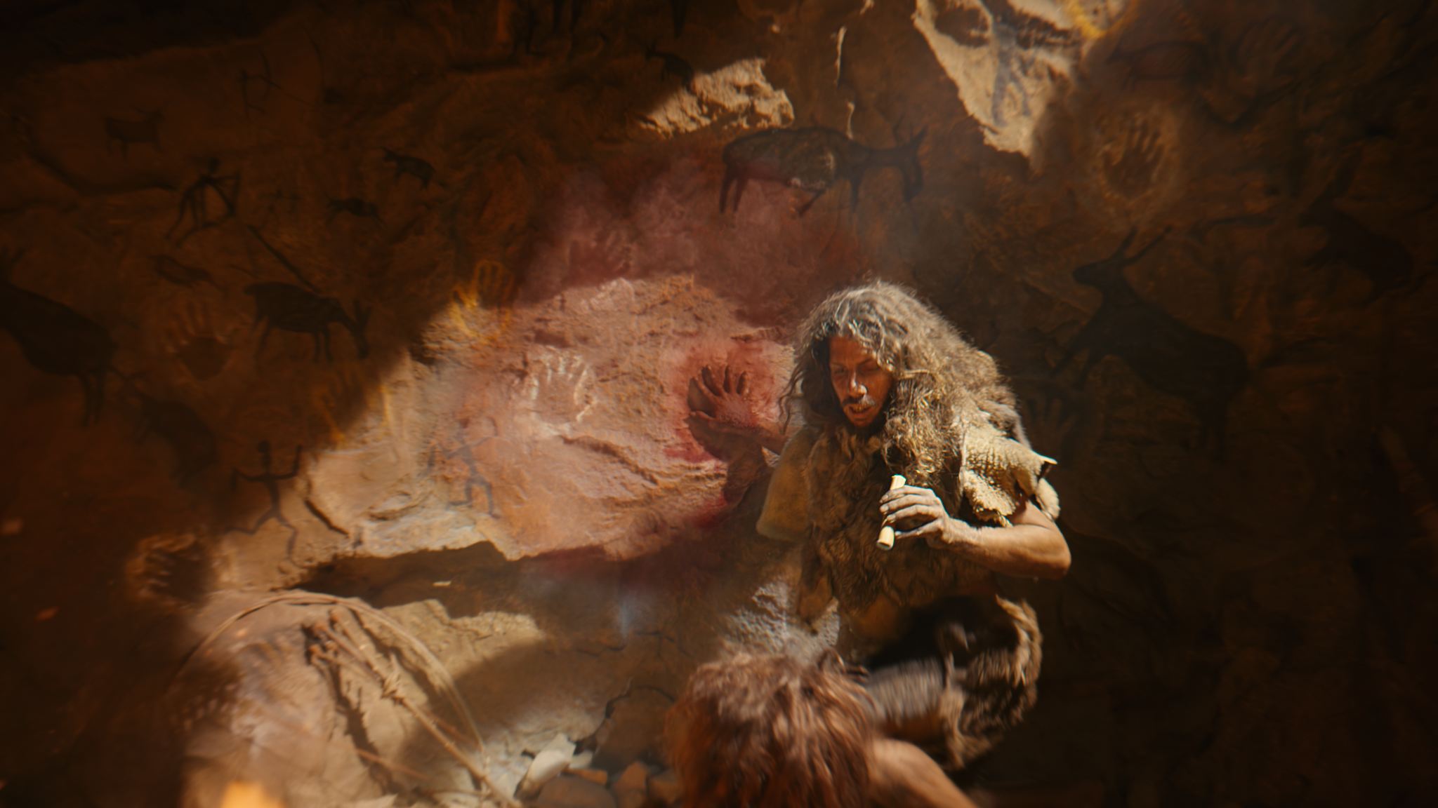
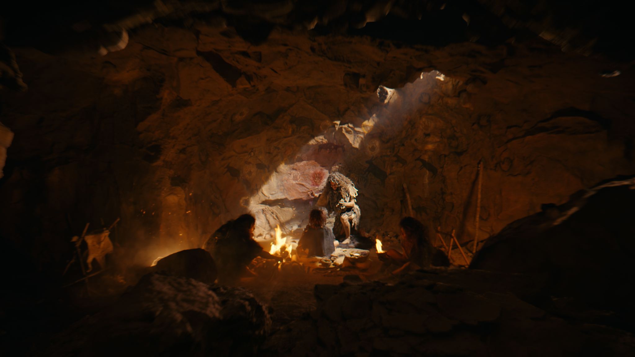
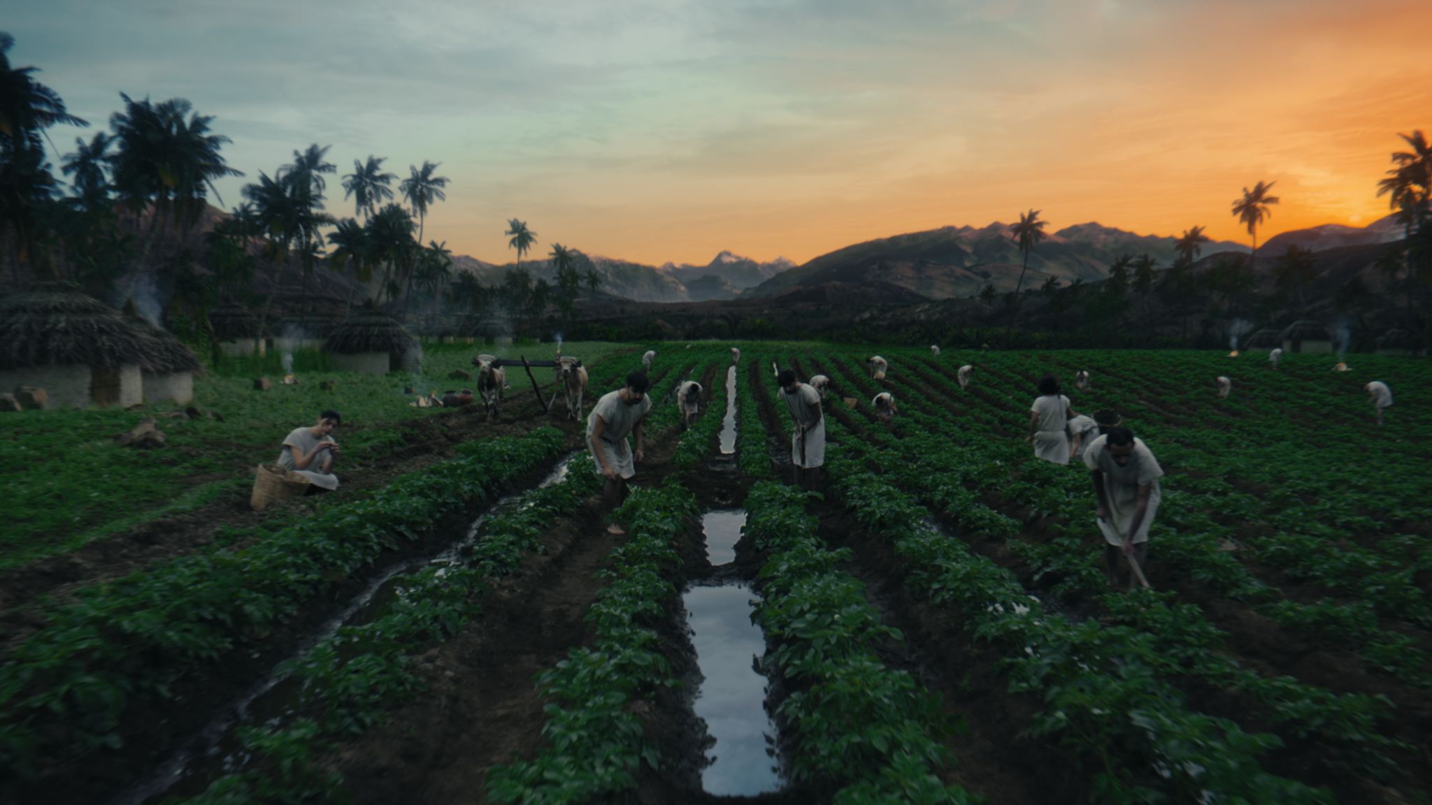
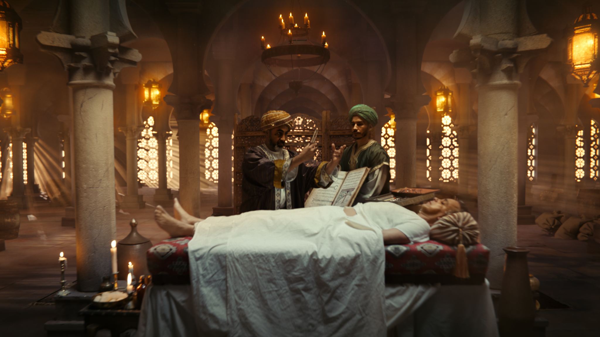
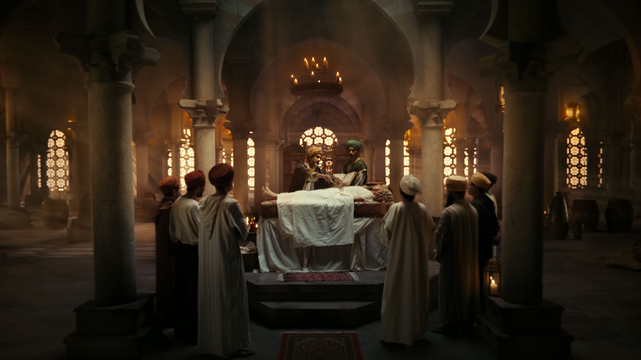
The concept art was done by the mighty folks at One Pixel Brush — which marked our first collaboration with them as well, and we’ve gotten to work together many times since. They were responsible for the environment designs, but we needed to tweak them to work with the linear backwards movement.
If I remember correctly, there was originally no complex previz planned, but everybody quickly realized we badly needed it to figure things out before the shoot. With the DOP Scott Cunningham and the Production Designer François Audouy, we went through each scene to figure out max possible speeds for the camera, set sizes, what can be visible with what lents etc. Huge learning curve to be able to work with these people.


Concept art by One Pixel Brush.
As usual in the commercial world, all things overlapped in a giant mix — as we were figuring out the previz, the storyboards were changing, the environment design was getting tweaked, and ideas kept flowing.
After the shoot, we kept designing things and figuring out ways to connect the worlds.
This was the project where my roles started blending together — as an art director from the initial treatment and figuring stuff out before the shoot, creating the previz, then designing some environments, being the right-hand man for the VFX supervisor, collaborating with our artists — be it concept artists, matte painters, comp, or 3D. I didn’t comp anything myself, but I did do overpaints of some of the shots for our compositors as a visual guide.

Reference mashup.
The Previz
This was my second previz ever, I think. So it was pre-Unreal for me, and it was done in Cinema4D. Very rough, but it did the job and helped the production. A lot of back and forth with our 3D artists, who helped with asset prep. Since the standard OPB workflow is to create the concept art in 3D already, we were taking their Blender scenes and transferring them into our pipeline — some parts went to me for previz and some to Maya/Houdini for finalization. I would then supply the 3D department with my final scenes from Cinema.
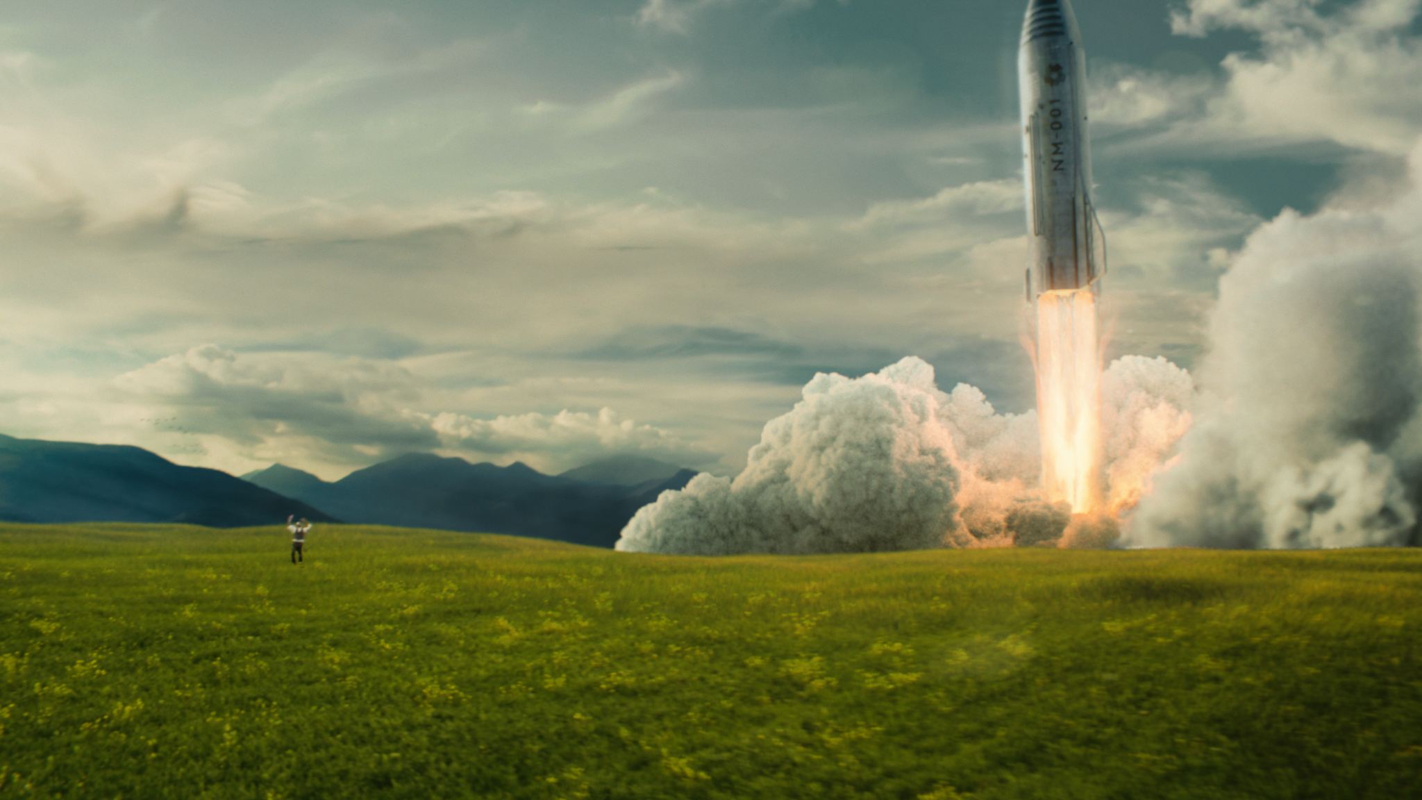
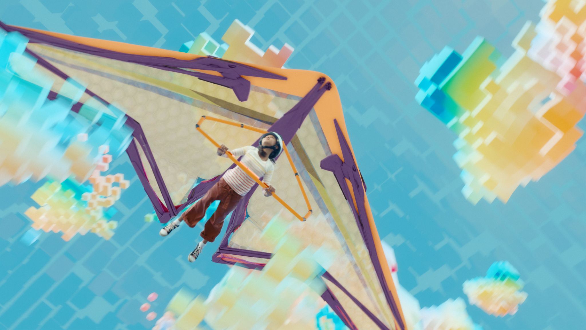
The biggest head fuck was the last shot going from the paper desert, to the glider and towards the desert. Seems like a simple move, but Maya was used for the beginning part in the paper desert, middle part with the glider was Blender and then going to a 3D scene in Flame with footage of the real desert projected on a card. Lovely!
We went through lots of iterations of the previz as the project was being developed very organically. I was responsible for bringing the previz edit together from multiple sources — it was a blend of my animation from Cinema, 2D boardomatics, and playblasts from other 3D artists.
The Design Part
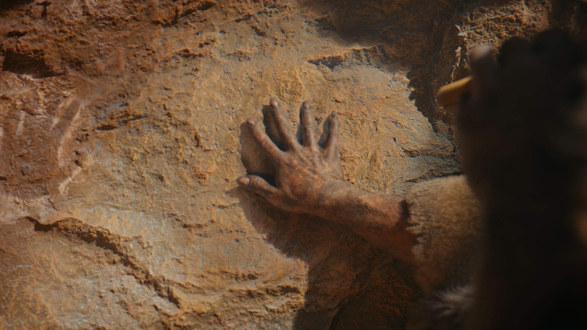
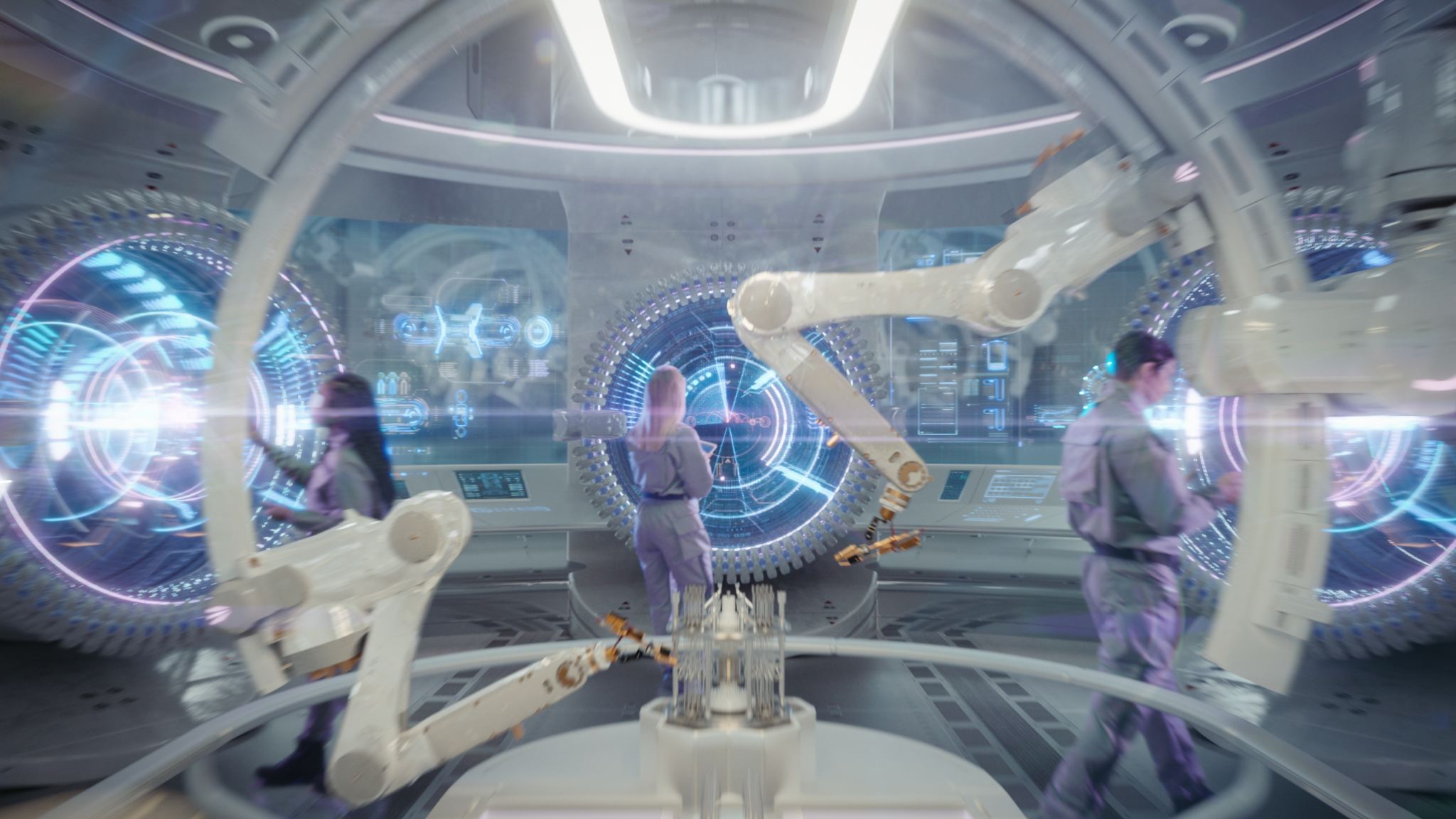
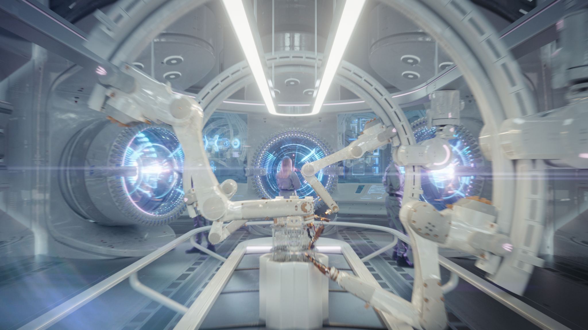
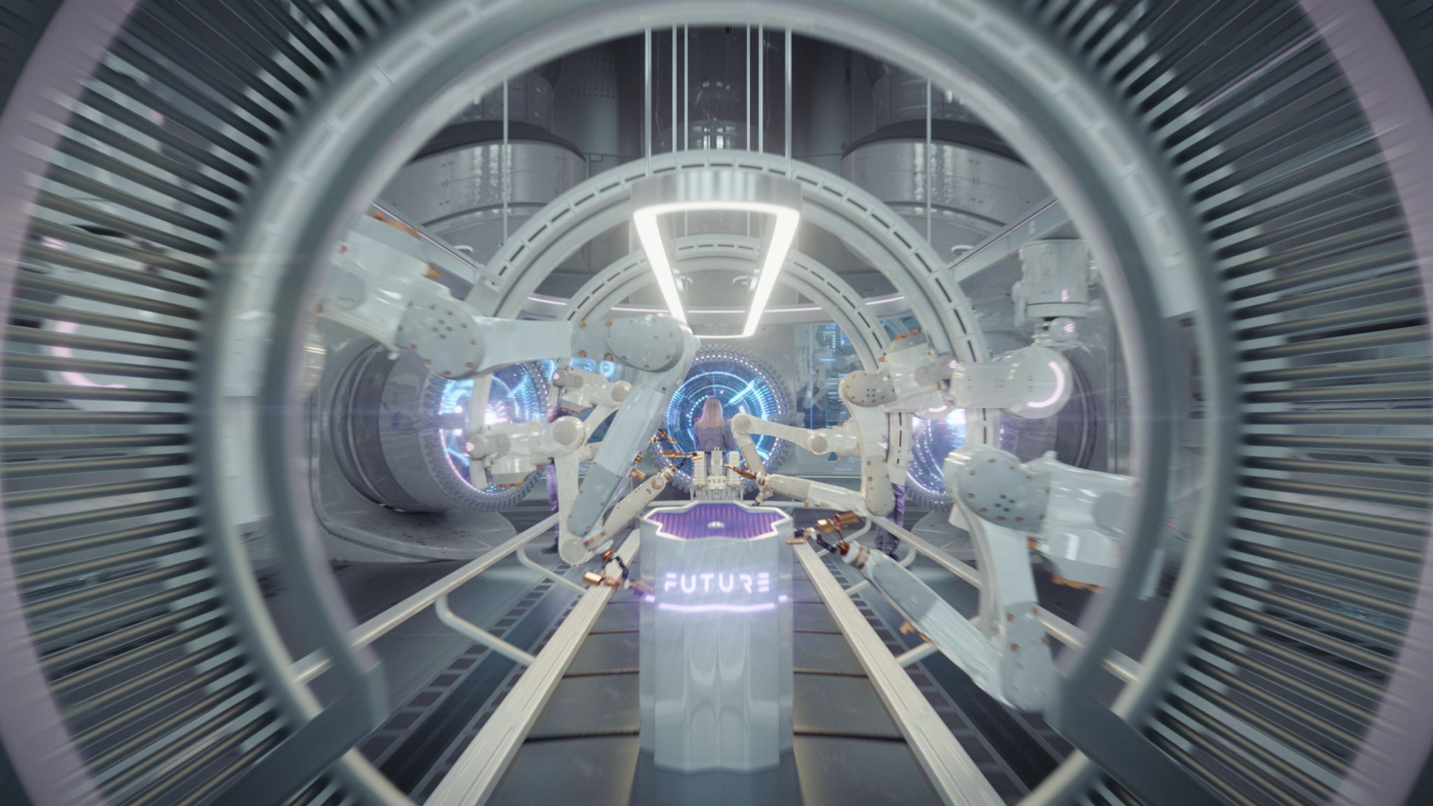
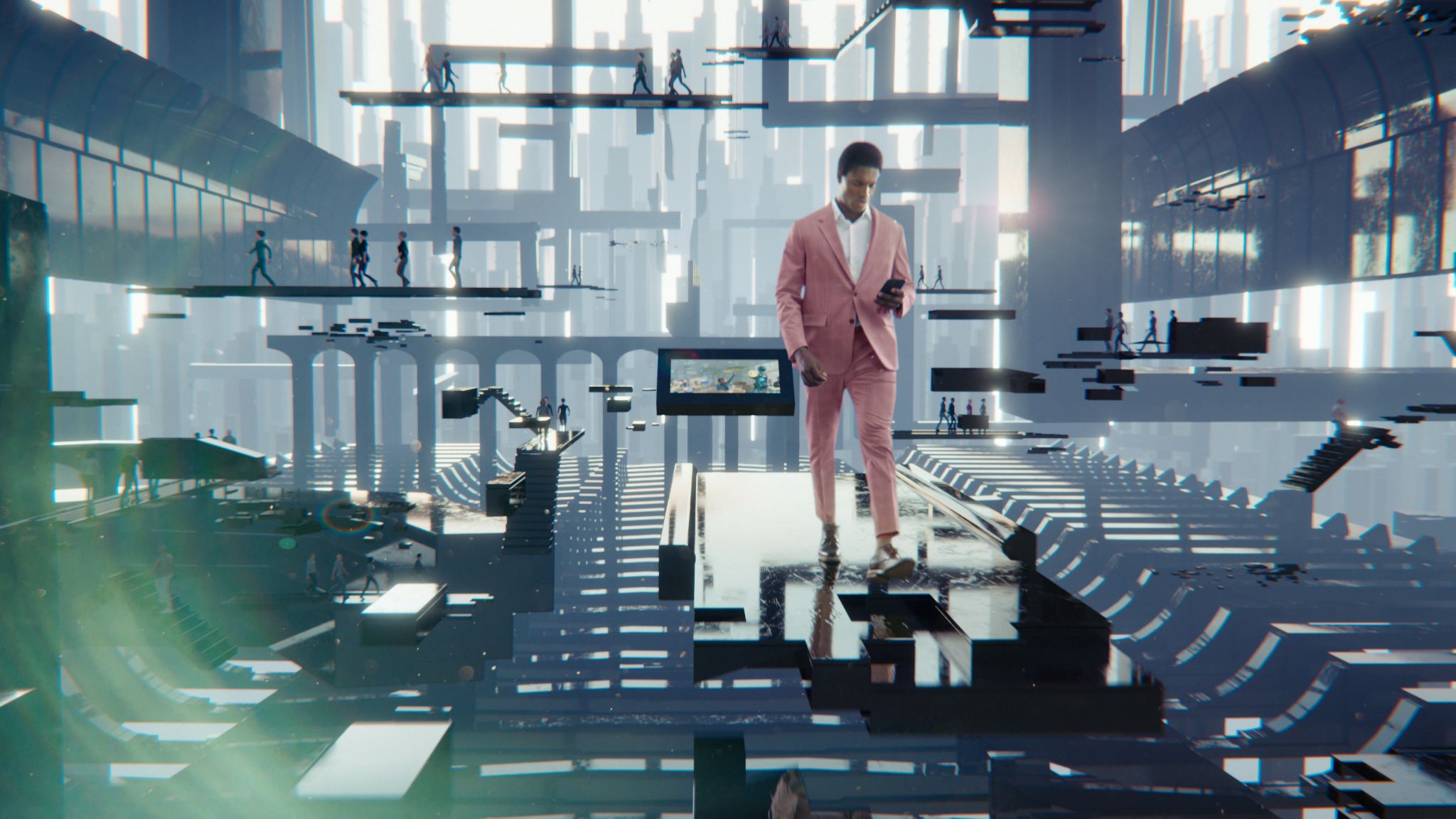
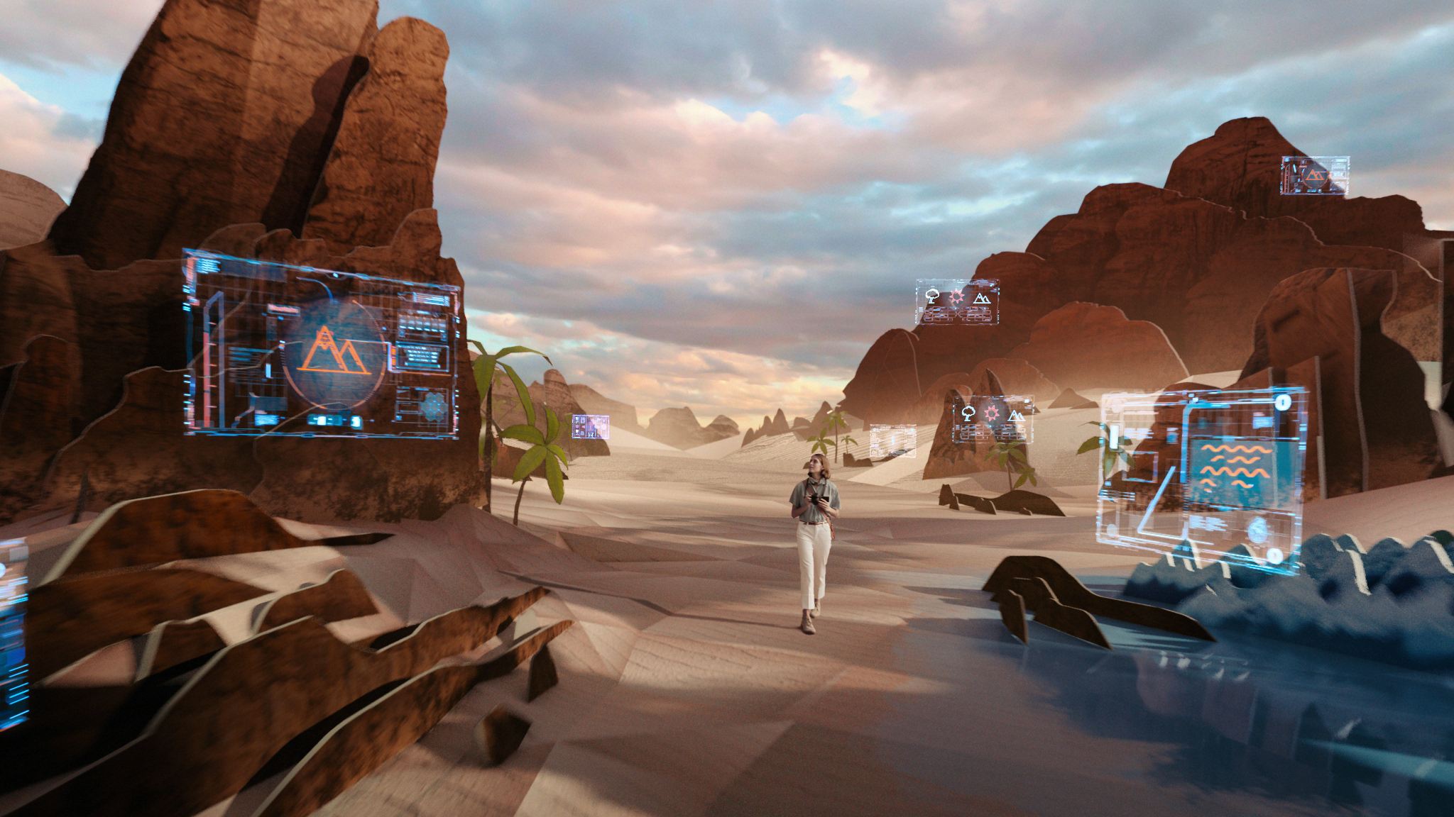
The future factory design was one that was missing from OPB concepts, and we needed to move into production quickly, so that became my main focus. According to the brief, this was some kind of futuristic factory with an assembly line of robot arms putting together some kind of super-futuristic game consoles.
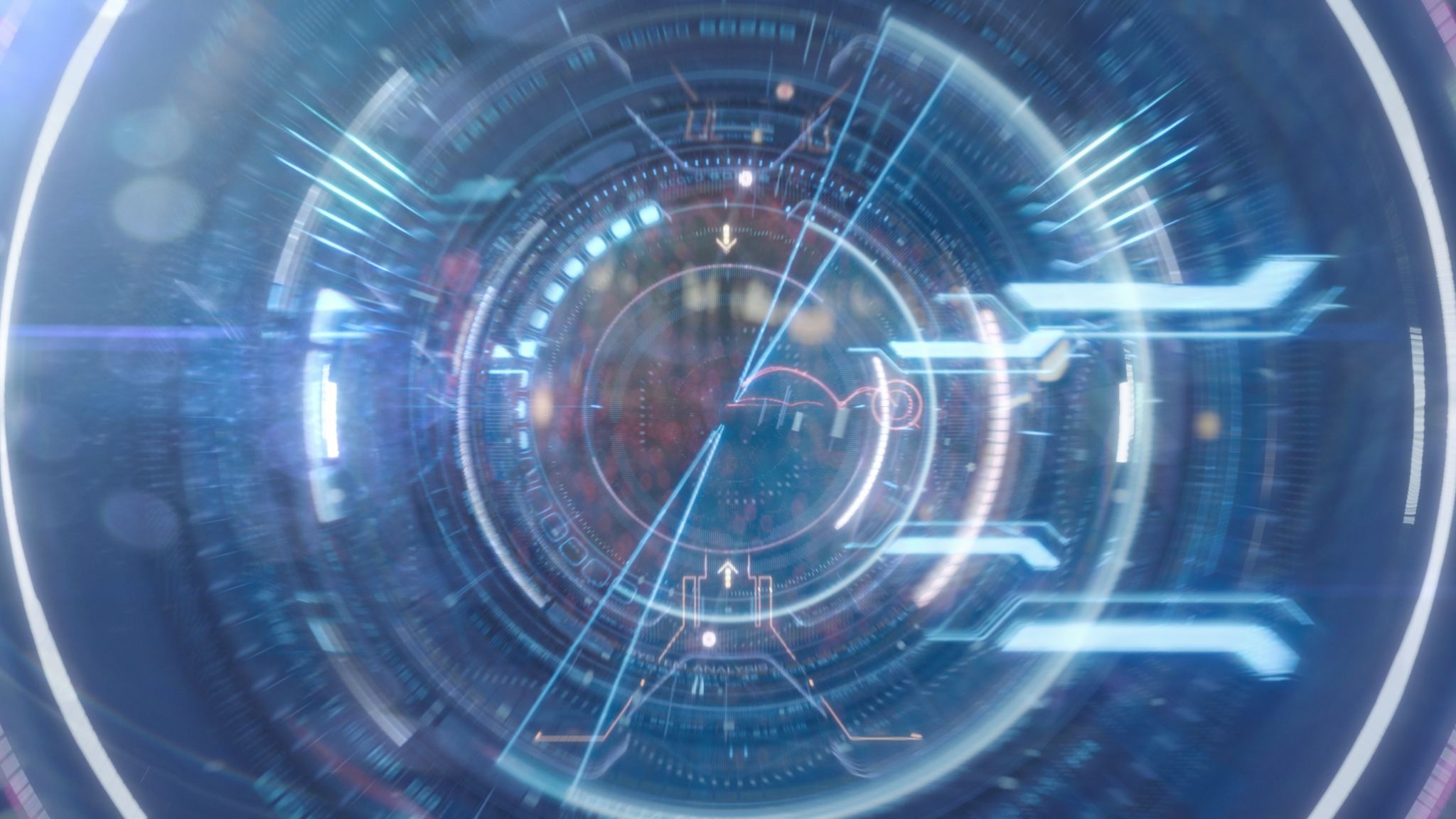
I knew it was supposed to go from the family in the forest through some kind of circular futuristic holographic user interface and then come out of the factory through the eye of another character. So the key to the design was really the eye shape.
I designed the room, modeled it very roughly in 3D, do the the previz with it, and then passed it to the 3D department for finishing. I also designed the console, whose shape was based on the NEOM logo — that’s a way to a satisfied client right there :)
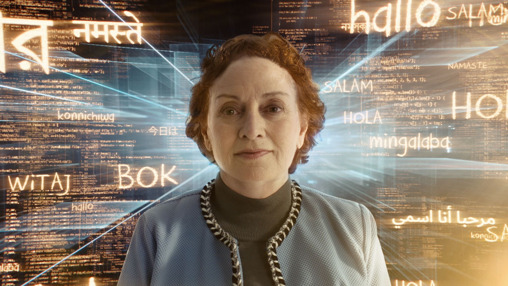
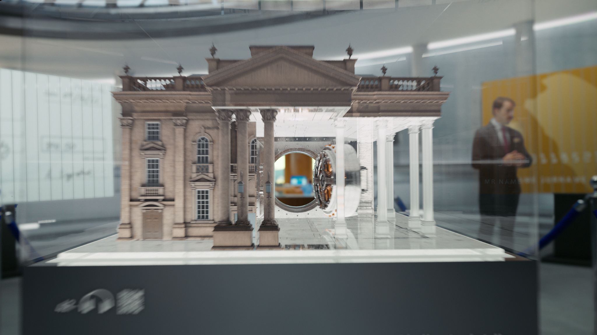
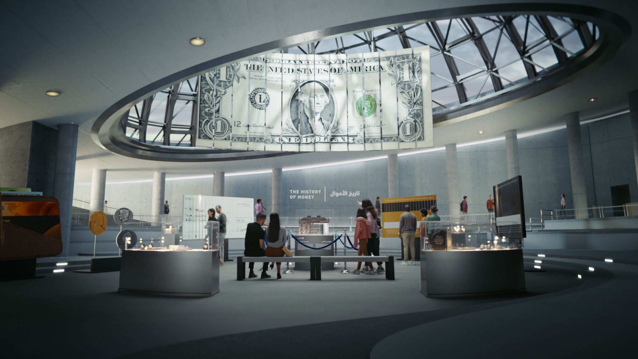
Some other designs were, for example, the background text holograms behind the aging lady, which I did in After Effects, and the design for the bank model on display in the museum of money.


The Conclusion
Huge experience back then for me with such a complex project, as well as for our whole studio. The project kind of showed my trajectory as a generalist designer and visualization artist — also using my background as a comp artist for final shot look.
Thanks for checking out the project!

© 2026 ROBOT BARON